Styles
The styles, what each is for, and how to switch.
Lumen comes with 4 styles. A style is a starting point: it sets colours, fonts, buttons, product cards and the homepage. All styles use the same sections, so anything you learn in one works in the others.
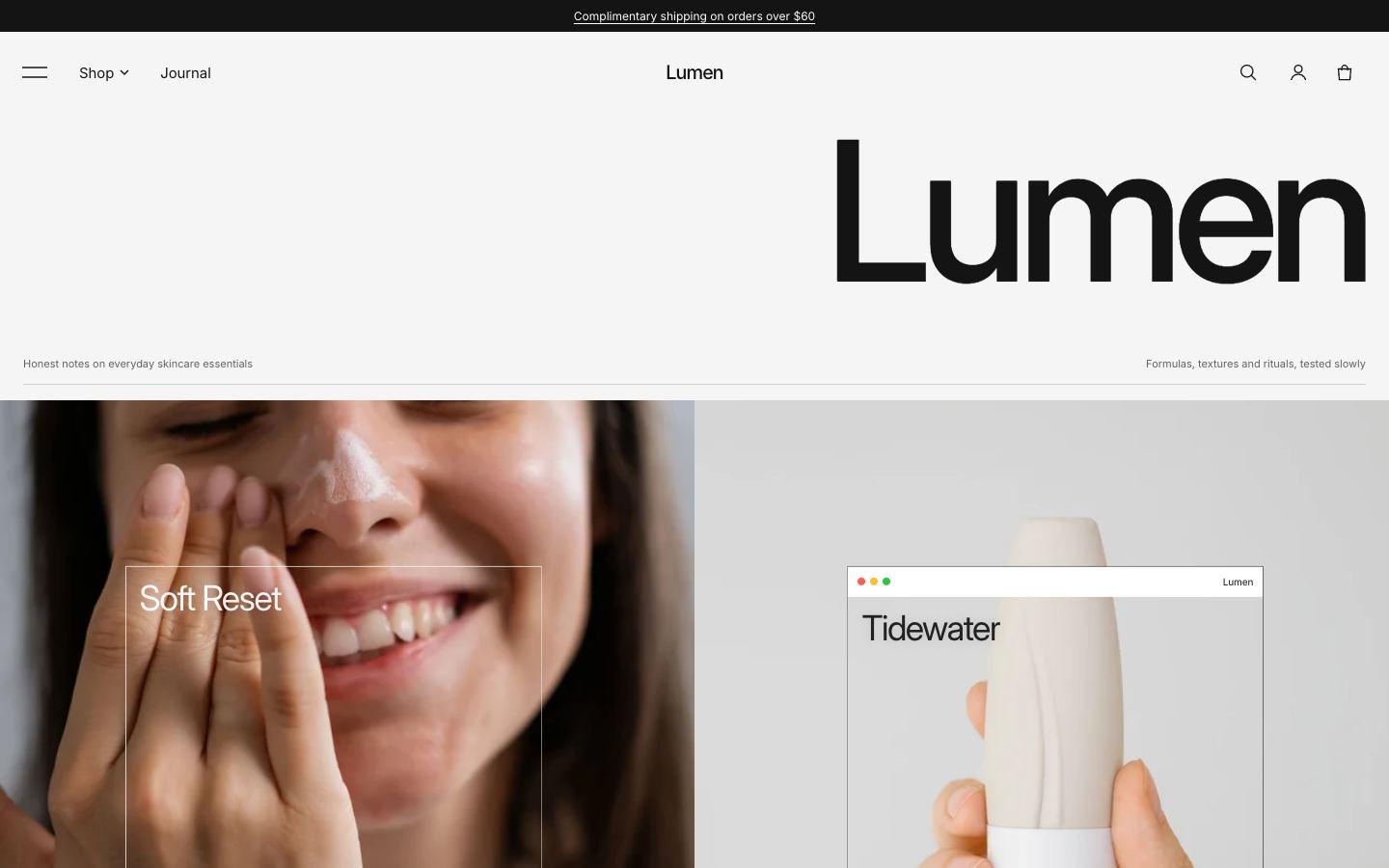
Lumen (default)
Bright and airy, with a large wordmark and a clay accent.
Made for skincare · Inter
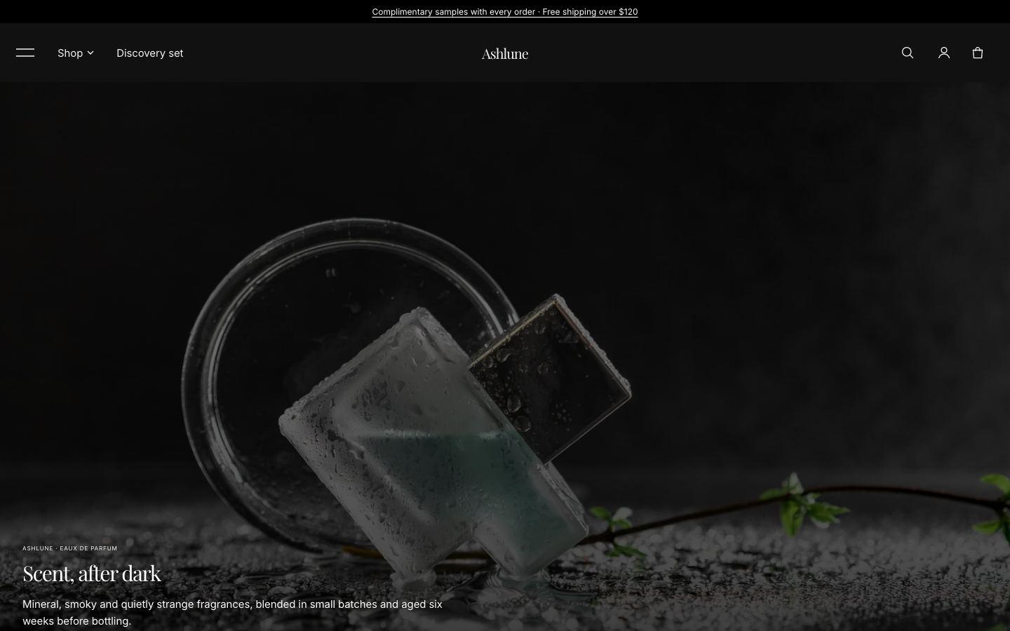
Ashlune
Dark and dramatic, with a video hero and a Playfair serif.
Made for fragrance · Playfair Display + Inter
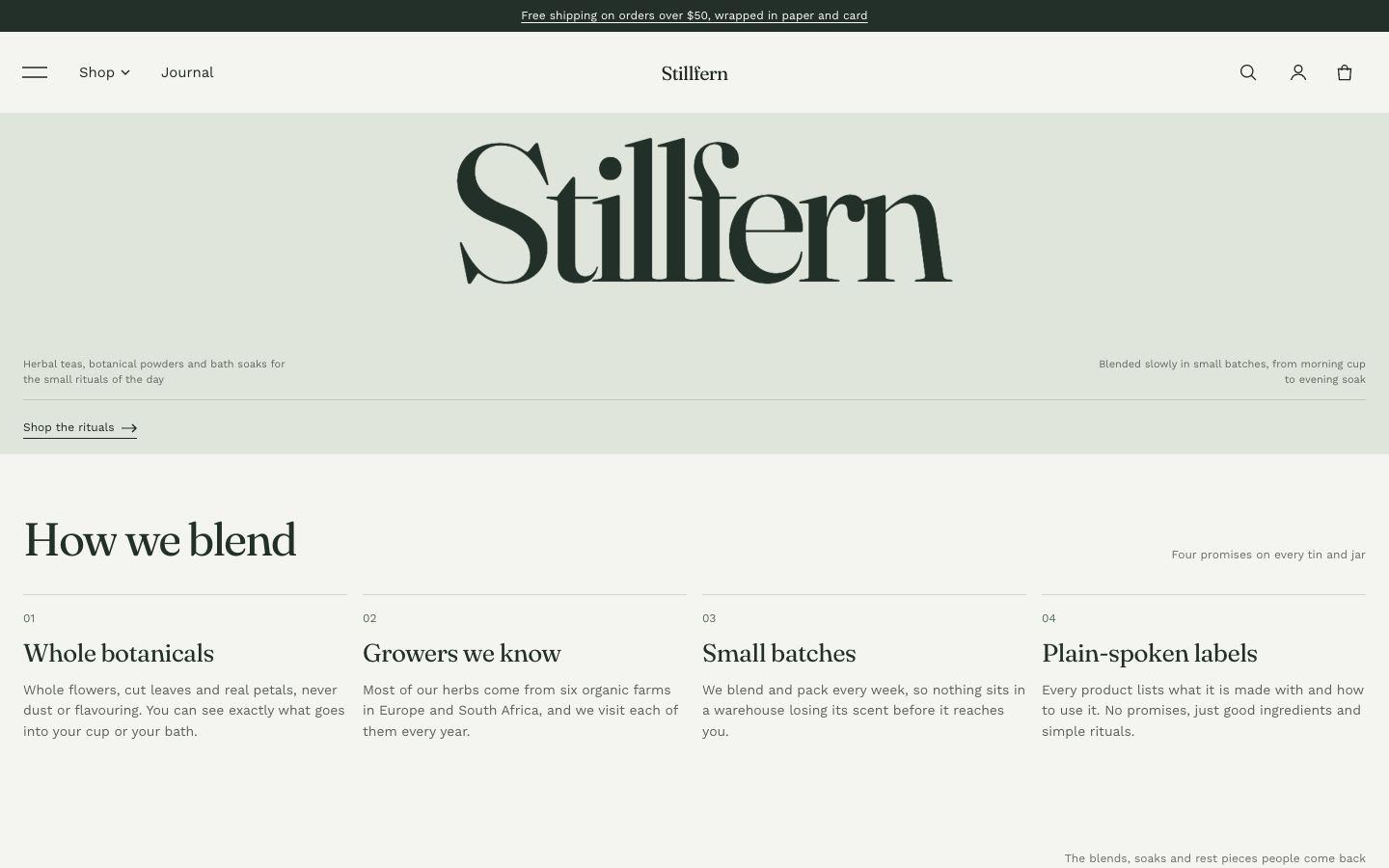
Stillfern
Soft greens and a daily-ritual timeline for calm, natural brands.
Made for wellness · Fraunces + Work Sans
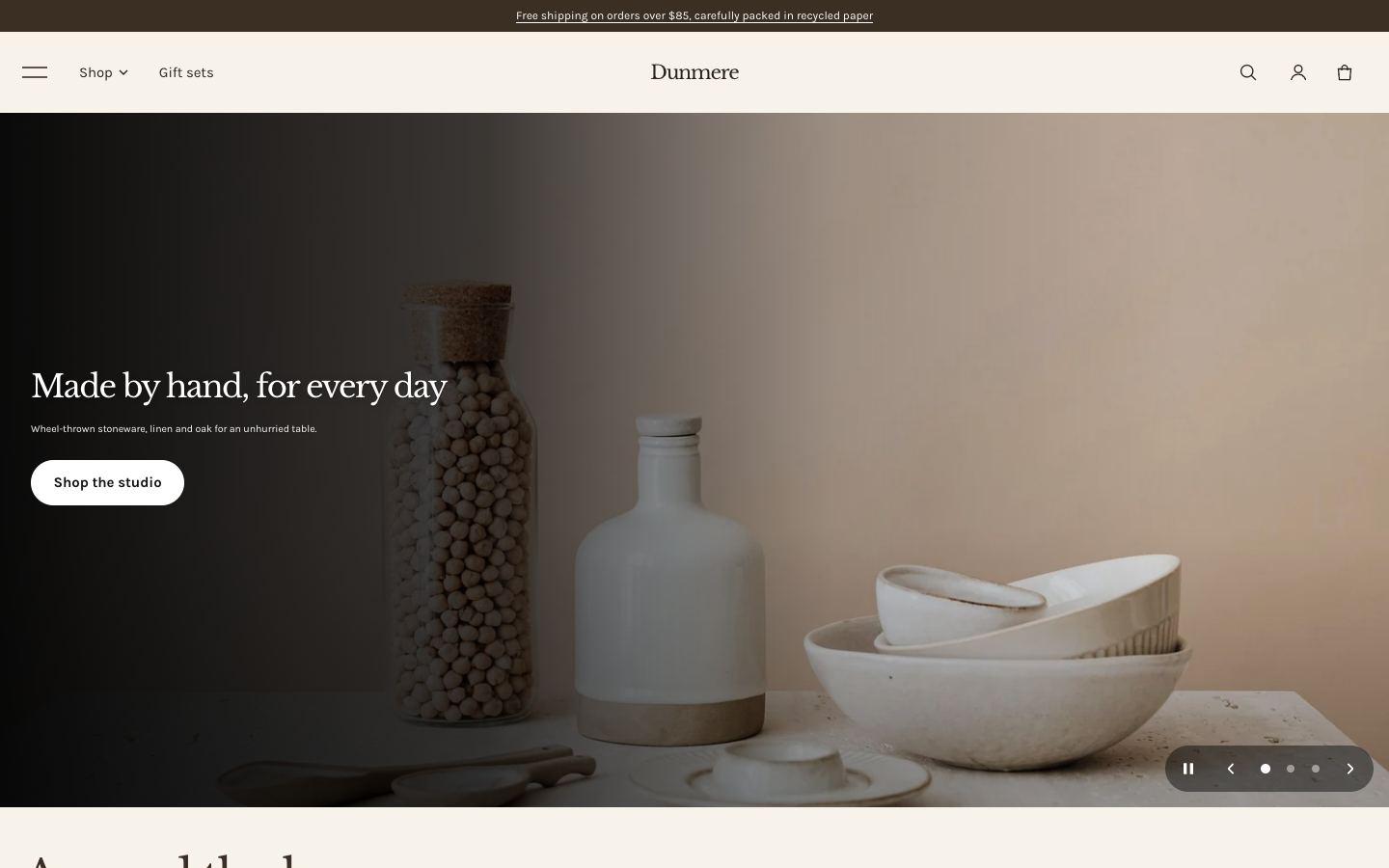
Dunmere
Warm sand tones and shop-the-table hotspots for interiors.
Made for homeware · Libre Baskerville + Karla
Choosing a style
You pick a style when you add Lumen from the Shopify Theme Store. Each style has a demo store you can browse first.
Switching style later
- Go to Online Store → Themes → Customize.
- Open Theme settings and choose Theme styles.
- Pick a style and click Save.
Switching changes your colours, typography, buttons and product cards. Your sections, text and images stay as they are: a style switch doesn't replace your homepage. To get a style's demo homepage, add Lumen to your theme library again with that style selected.
Tip: try a style on a copy of your theme first (Actions → Duplicate in Online Store → Themes).